African Conflicts
A Series Exploring Conflicts on the Content

African Conflicts
The data is from African Conflict Location and Event Data Project and can be downloaded from Kaggle https://www.kaggle.com/jboysen/african-conflicts
From the Kaggle Description:
“This dataset codes the dates and locations of all reported political violence and protest events in dozens of developing countries in Africa. Political violence and protest includes events that occur within civil wars and periods of instability, public protest and regime breakdown. The project covers all African countries from 1997 to the present.”
import numpy as np
import pandas as pd
import matplotlib.pyplot as plt
import seaborn as sns
%matplotlib inline
pd.options.display.max_columns = 999
df = pd.read_csv('african_conflicts.csv', encoding ='latin1', low_memory = False)
df.head()
| ACTOR1 | ACTOR1_ID | ACTOR2 | ACTOR2_ID | ACTOR_DYAD_ID | ADMIN1 | ADMIN2 | ADMIN3 | ALLY_ACTOR_1 | ALLY_ACTOR_2 | COUNTRY | EVENT_DATE | EVENT_ID_CNTY | EVENT_ID_NO_CNTY | EVENT_TYPE | FATALITIES | GEO_PRECISION | GWNO | INTER1 | INTER2 | INTERACTION | LATITUDE | LOCATION | LONGITUDE | NOTES | SOURCE | TIME_PRECISION | YEAR | |
|---|---|---|---|---|---|---|---|---|---|---|---|---|---|---|---|---|---|---|---|---|---|---|---|---|---|---|---|---|
| 0 | Police Forces of Algeria (1999-) | NaN | Civilians (Algeria) | NaN | NaN | Tizi Ouzou | Beni-Douala | NaN | NaN | Berber Ethnic Group (Algeria) | Algeria | 18/04/2001 | 1416RTA | NaN | Violence against civilians | 1 | 1 | 615 | 1 | 7 | 17 | 36.61954 | Beni Douala | 4.08282 | A Berber student was shot while in police cust... | Associated Press Online | 1 | 2001 |
| 1 | Rioters (Algeria) | NaN | Police Forces of Algeria (1999-) | NaN | NaN | Tizi Ouzou | Tizi Ouzou | NaN | Berber Ethnic Group (Algeria) | NaN | Algeria | 19/04/2001 | 2229RTA | NaN | Riots/Protests | 0 | 3 | 615 | 5 | 1 | 15 | 36.71183 | Tizi Ouzou | 4.04591 | Riots were reported in numerous villages in Ka... | Kabylie report | 1 | 2001 |
| 2 | Protesters (Algeria) | NaN | NaN | NaN | NaN | Bejaia | Amizour | NaN | Students (Algeria) | NaN | Algeria | 20/04/2001 | 2230RTA | NaN | Riots/Protests | 0 | 1 | 615 | 6 | 0 | 60 | 36.64022 | Amizour | 4.90131 | Students protested in the Amizour area. At lea... | Crisis Group | 1 | 2001 |
| 3 | Rioters (Algeria) | NaN | Police Forces of Algeria (1999-) | NaN | NaN | Bejaia | Amizour | NaN | Berber Ethnic Group (Algeria) | NaN | Algeria | 21/04/2001 | 2231RTA | NaN | Riots/Protests | 0 | 1 | 615 | 5 | 1 | 15 | 36.64022 | Amizour | 4.90131 | Rioters threw molotov cocktails, rocks and bur... | Kabylie report | 1 | 2001 |
| 4 | Rioters (Algeria) | NaN | Police Forces of Algeria (1999-) | NaN | NaN | Tizi Ouzou | Beni-Douala | NaN | Berber Ethnic Group (Algeria) | NaN | Algeria | 21/04/2001 | 2232RTA | NaN | Riots/Protests | 0 | 1 | 615 | 5 | 1 | 15 | 36.61954 | Beni Douala | 4.08282 | Rioters threw molotov cocktails, rocks and bur... | Kabylie report | 1 | 2001 |
df.info()
<class 'pandas.core.frame.DataFrame'>
RangeIndex: 165808 entries, 0 to 165807
Data columns (total 28 columns):
ACTOR1              165808 non-null object
ACTOR1_ID           140747 non-null float64
ACTOR2              122255 non-null object
ACTOR2_ID           140747 non-null float64
ACTOR_DYAD_ID       140747 non-null object
ADMIN1              165808 non-null object
ADMIN2              165676 non-null object
ADMIN3              86933 non-null object
ALLY_ACTOR_1        28144 non-null object
ALLY_ACTOR_2        19651 non-null object
COUNTRY             165808 non-null object
EVENT_DATE          165808 non-null object
EVENT_ID_CNTY       165808 non-null object
EVENT_ID_NO_CNTY    140747 non-null float64
EVENT_TYPE          165808 non-null object
FATALITIES          165808 non-null int64
GEO_PRECISION       165808 non-null int64
GWNO                165808 non-null int64
INTER1              165808 non-null int64
INTER2              165808 non-null int64
INTERACTION         165808 non-null int64
LATITUDE            165808 non-null object
LOCATION            165805 non-null object
LONGITUDE           165808 non-null object
NOTES               155581 non-null object
SOURCE              165635 non-null object
TIME_PRECISION      165808 non-null int64
YEAR                165808 non-null int64
dtypes: float64(3), int64(8), object(17)
memory usage: 35.4+ MB
There are a lot of features in this data set. I’m particularly interested Country where a conflict occured, which countries or groups of people were involved, when the event took place, How many fatalities, some notes on the conflict, and what type of conflict was it.
So I am going to limit our data set to these columns
df = df.loc[:,['ACTOR1', 'ACTOR2', 'ADMIN1', 'ADMIN2','COUNTRY', 'LOCATION', 'EVENT_DATE', 'EVENT_TYPE', 'INTERACTION', 'FATALITIES', 'NOTES']]
df.head()
| ACTOR1 | ACTOR2 | ADMIN1 | ADMIN2 | COUNTRY | LOCATION | EVENT_DATE | EVENT_TYPE | INTERACTION | FATALITIES | NOTES | |
|---|---|---|---|---|---|---|---|---|---|---|---|
| 0 | Police Forces of Algeria (1999-) | Civilians (Algeria) | Tizi Ouzou | Beni-Douala | Algeria | Beni Douala | 18/04/2001 | Violence against civilians | 17 | 1 | A Berber student was shot while in police cust... |
| 1 | Rioters (Algeria) | Police Forces of Algeria (1999-) | Tizi Ouzou | Tizi Ouzou | Algeria | Tizi Ouzou | 19/04/2001 | Riots/Protests | 15 | 0 | Riots were reported in numerous villages in Ka... |
| 2 | Protesters (Algeria) | NaN | Bejaia | Amizour | Algeria | Amizour | 20/04/2001 | Riots/Protests | 60 | 0 | Students protested in the Amizour area. At lea... |
| 3 | Rioters (Algeria) | Police Forces of Algeria (1999-) | Bejaia | Amizour | Algeria | Amizour | 21/04/2001 | Riots/Protests | 15 | 0 | Rioters threw molotov cocktails, rocks and bur... |
| 4 | Rioters (Algeria) | Police Forces of Algeria (1999-) | Tizi Ouzou | Beni-Douala | Algeria | Beni Douala | 21/04/2001 | Riots/Protests | 15 | 0 | Rioters threw molotov cocktails, rocks and bur... |
The column Interaction actually tells us quite a bit. The first digit is the type of Actor 1, and the second digit is the type of Actor 2. From the Userguide:
A numeric code indicating the interaction between types of ACTOR1 and ACTOR2. Coded as an interaction between actor types, and recorded as lowest joint number:
- 1 Government/Military/Police
- 2 Rebel group
- 3 Political Militia
- 4 Communal Militia
- 5 Rioters
- 6 Protestors
- 7 Civilians
- 8 Other (e.g. Regional groups such as AFICOM; or UN
e.g. When the action is between a government and a rebel group, this will be coded as 12; when a political militia attacks civilians, it is coded as 37.
df.info()
<class 'pandas.core.frame.DataFrame'>
RangeIndex: 165808 entries, 0 to 165807
Data columns (total 11 columns):
ACTOR1         165808 non-null object
ACTOR2         122255 non-null object
ADMIN1         165808 non-null object
ADMIN2         165676 non-null object
COUNTRY        165808 non-null object
LOCATION       165805 non-null object
EVENT_DATE     165808 non-null object
EVENT_TYPE     165808 non-null object
INTERACTION    165808 non-null int64
FATALITIES     165808 non-null int64
NOTES          155581 non-null object
dtypes: int64(2), object(9)
memory usage: 13.9+ MB
Suprisingly the above shows that we don’t have a lot of Null values. Only in places we might expect such as ‘Notes’ or ‘Actor2’. I know I’m want to explore conflicts as they progress over time so I better enocde Event_Date as a datetime object
df['EVENT_DATE'] = pd.to_datetime(df['EVENT_DATE'])
Exploratory Data Analysis
Off the bat here are some things I’m curious about:
- In the last 5 years which African country had the most conflict events?
- most fatalities?
- what type of events were those?
df[doi].COUNTRY.value_counts().head(10)
Somalia                         16916
Nigeria                          8933
South Africa                     8425
Sudan                            7849
Egypt                            7829
Democratic Republic of Congo     6368
Libya                            5752
South Sudan                      5083
Burundi                          4479
Tunisia                          3740
Name: COUNTRY, dtype: int64
doi = df['EVENT_DATE'] > '2012'
plt.figure(figsize=(8,6))
sns.countplot(x = 'COUNTRY',data = df[doi], order=df[doi].COUNTRY.value_counts().head(10).index,
             )
plt.xticks(rotation = 90)
(array([0, 1, 2, 3, 4, 5, 6, 7, 8, 9]), <a list of 10 Text xticklabel objects>)
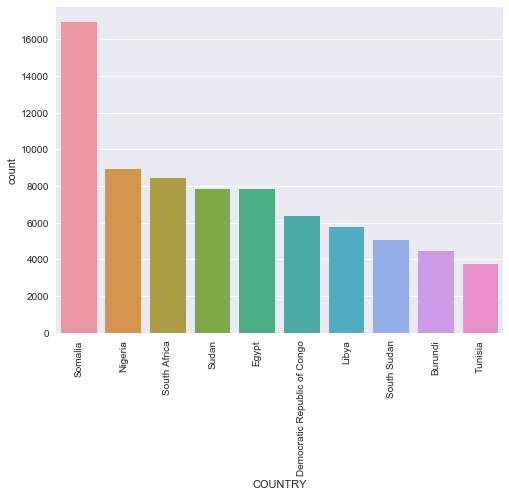
In the last 5 years Somalia by far has had the most events, more that double that most of the other African Countries. The list isnt too suprising if you’ve been paying attention to the news. We see some North African Countries: Libya, Tunisia, Egypt so this data shows the after effects of Arab Springs. Remember also that in 2011 Gadaffi was overthrown.
Lets see this list by fatalities
plt.figure(figsize=(8,6))
sns.barplot(x='COUNTRY', y='FATALITIES', data = df[doi],
            estimator = sum,
            ci = None,
           order = df[doi].groupby('COUNTRY')['FATALITIES'].sum().sort_values(ascending = False).head(10).index)

plt.xticks(rotation = 90)
plt.ylabel('Total Sum of Fatalities')
<matplotlib.text.Text at 0x1fcdf569668>
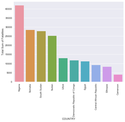
Very very interesting! Although Somalia had the most number of incidents, Nigeria by far had the most fatalities. I wonder what type of conflicts occured there? Lets take a look!
dfdoi = df[doi]
nigeria = dfdoi['COUNTRY']=='Nigeria'
plt.figure(figsize = (12,6))
sns.countplot(x = 'INTERACTION', data = dfdoi[nigeria])
<matplotlib.axes._subplots.AxesSubplot at 0x1fcdf1b77f0>
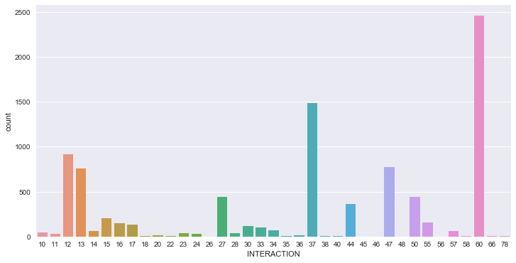
60 refers to Protestors Sole Action, that actually is a decent measure of unrest in a country, and entirely possible there were no fatalities during many of these protests. Lets do a quick pandas query sorting INTERACTION type by number of fatalities
dfdoi[nigeria].groupby('INTERACTION')['FATALITIES'].sum().sort_values(ascending = False)
INTERACTION
12    9807
37    8388
27    7781
47    5730
13    3951
44    1432
17    1285
28     681
34     588
15     428
33     390
14     339
23     284
24     238
55     189
16      69
22      46
50      44
57      41
11      32
20      14
78      10
38       8
56       8
30       5
36       5
35       2
46       2
60       2
18       1
58       1
26       0
66       0
40       0
45       0
48       0
10       0
Name: FATALITIES, dtype: int64
AHA! This tells us much more information. Turns out there were 2 fatalities in all of those protests. And almost 10,000 people were killed in MILITARY vs REBEL conflicts.
Also take a look at the next 3 numbers. Theres a common element, the digit ‘7’. This unfortunately represents Civilians. As in there was a vast amount of fatal violent conflicts directed towards Civilians by Military, Rebel, and Militia groups. An unfortunate reality that is all too common in places where multiple factions are fighting for a piece of the pie
This was just a brief introduction into the dataset. I am definitly going to make this a series where I’ll gather insights, throw in some interactive plots, and definitly maps to help visualize the conflicts that have ravaged one of most beautiful continents on Earth.
Mosquitos and Heat Maps
Predicting the Geographical Spread of West Nile Virus in Chicago
This project was particularly fascinating to me for a multitude of reasons.
Having actually suffered and recovered from malaria, I was interested in how mosquito vectors could spread other diseases, and with my background in public health and medicine I wanted to know how West Nile spread in Chicago.
I got the inspiration from browsing kaggle datasets as we data scientists do looking for interesting things to play around with. This is the kaggle competition for those interested.
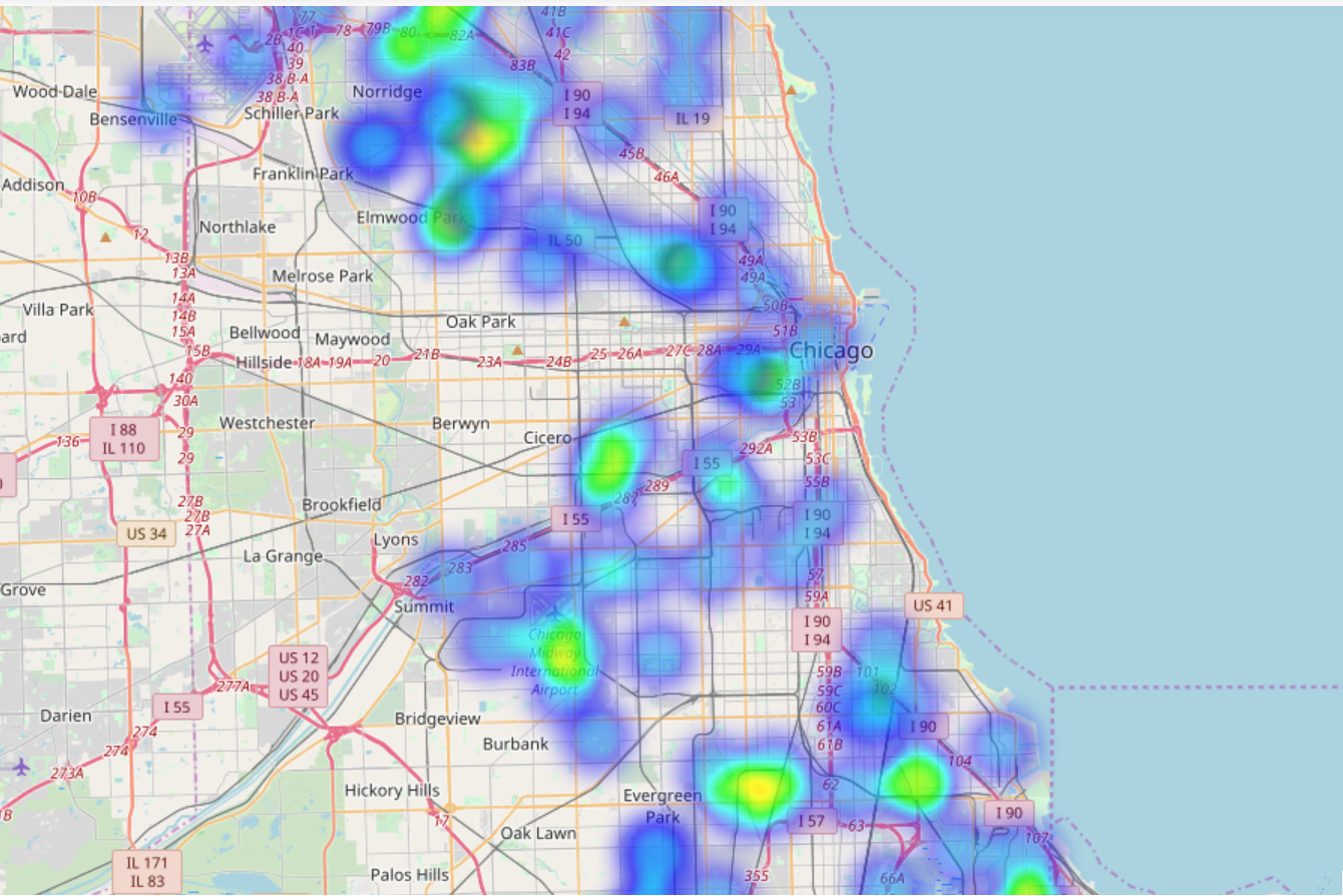
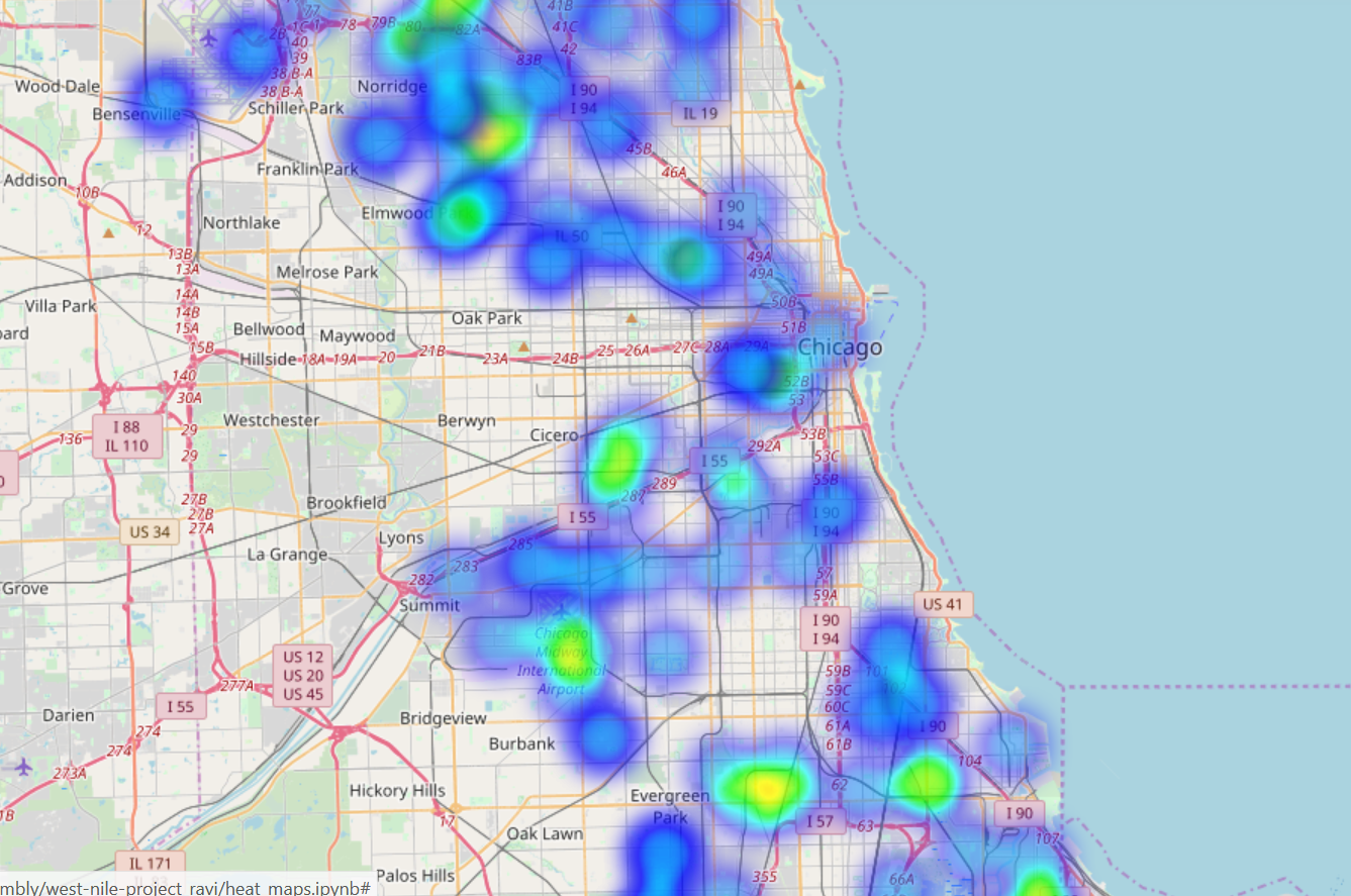
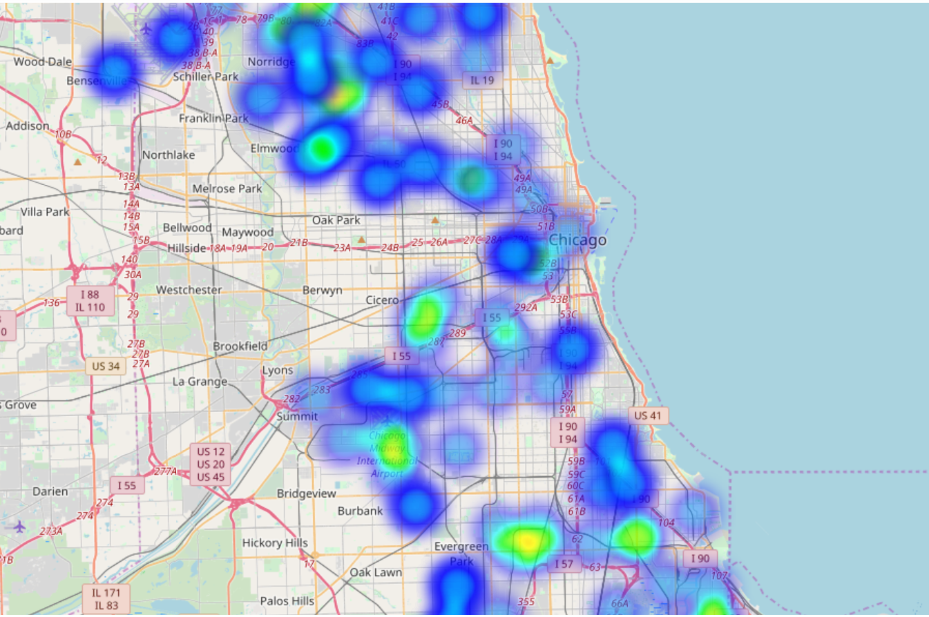
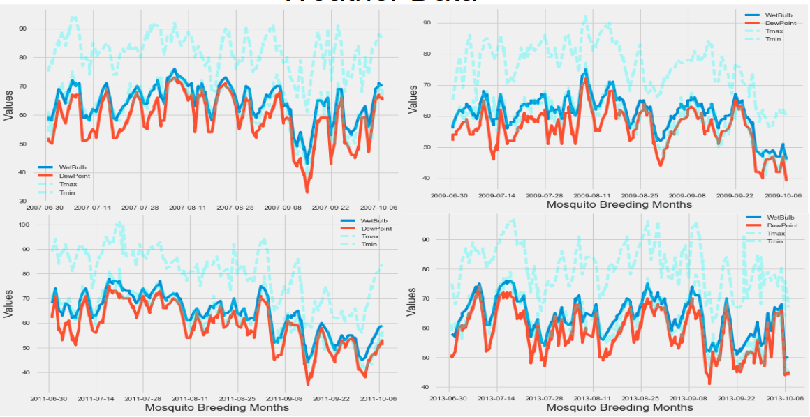
First things first: Heatmaps year by year for the training data
Training data was data from the odd years between 2007 to 2013. The testing data set contained the even years and I treated it as sacred
2007
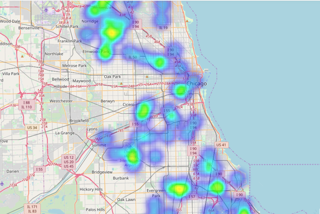
2009
2011
2013
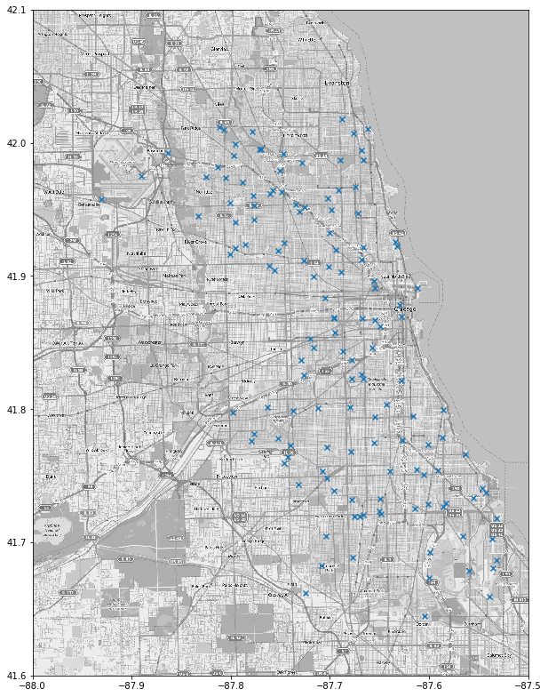
And here is where they placed the traps:
Description of Project and some Results
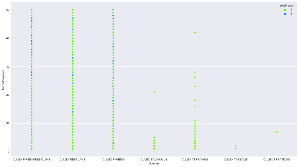
The task at hand was to predict where West Nile Virus would show up based on data collected from the various mosquito traps dispersed through the greater Chicago region. There were 8 species of mosquitos collected, but a vast majority of them were some type of Culex Pipiens/Restuans. Here is the distribution of positive West Nile cases by Species for every time data was collected from a mosquito trap.
Additionally I had weather data available to me over the dame time period West Nile was running rampant through Chicago. This was vitally important since mosquito breeding season are the summer months, and mosquitoes prefer humid, tropical climates, and they don’t like rain. Here is the weather data, with min and max temperature, wetbulb, and dewpoint for humidity analogs.
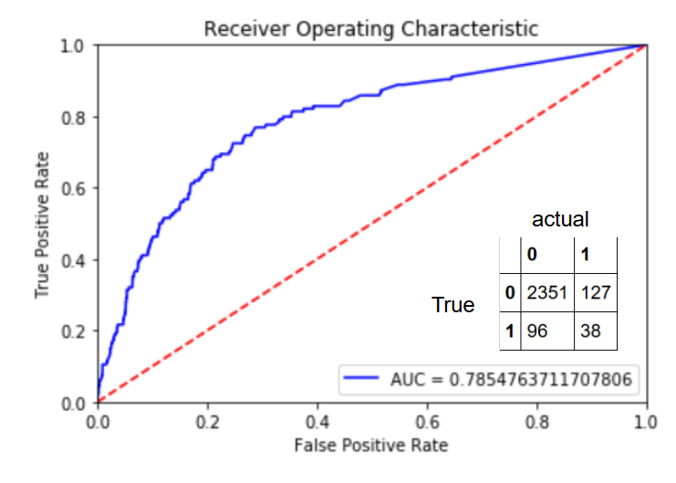
So on to the modeling! After cleaning, feature engineering, and merging the weather data and training data collected from the traps I decided to make a random forest classifier. However we had one issue: we had some seriously unbiased classes.
- West Nile negative: 9955 cases
- West Nile positive: 551 cases.
To combat this and prevent my model from just predicting zeros and calling it a day, I oversampled the minority classes. Essentially I artificially created more positive cases to match a 1:1 ratio with the negative cases. But first I split my data, and oversampled one split, and used the other split as a holdout set to test my model against.
Here are my results for the Random Forest Classifier:
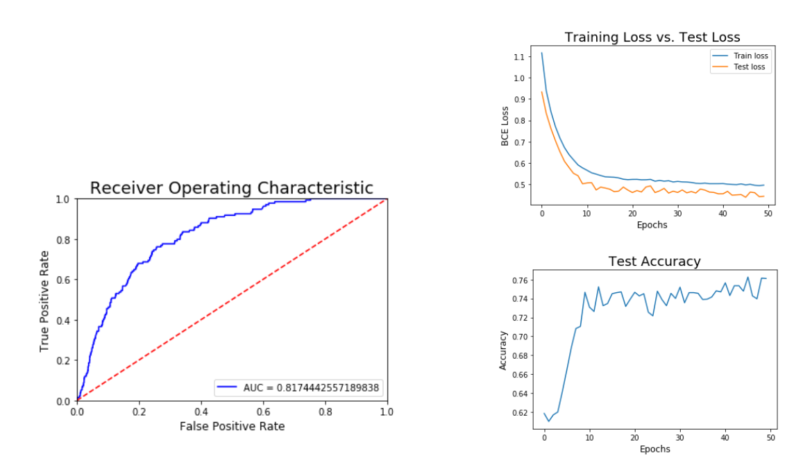
Also tried out a Neural Network with these results:
Battle of the Clusters
A Comparison of 3 Common Clustering Algorithims

Battle of the Clusters
I wanted to visually test three of the clustering algorithms that are commonly used on 7 data sets that are specifically designed to evaluate clustering algorithm effectiveness.
The three algorithims I’m going to use are:
K-means: k-means clustering
Agglomerative clustering: hierarchical clustering (bottom up)
DBSCAN: density-based clustering.
Clustering, I believe, is particularly suited for visual representations, and it’s very easy to gain an intuition on how each algorithim performs based on visuals.
For ease of use the 7 datasets I generated have 2 dimensions, an X and y coordinate. Remember that in unsupervised learning methods like clustering, there generally will not be “true labels.” I provided them here as colors simply as a convenience to be able to compare with the algorithims
Here are the 7 datasets clustered by color. We are going to see how close the clustering algorithms can get to these images.
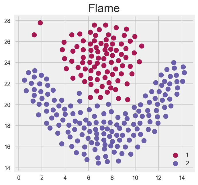
Flame
Which algorithm (visually) performs best?
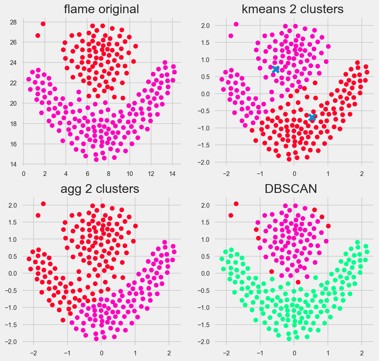
DBSCAN performed the best. The great thing about DBSCAN is that we can really tune its hyperparameters: epsilon (the distance between samples) and miniminum number of core samples needed to define a cluster.
Interestingly Kmeans and the heirarchal algorithims performed similarly. Looking at the center of the Kmeans we see the centers that the algorithm eventually converged on are ‘off’ in comparison to how we as humans visually see a flame.
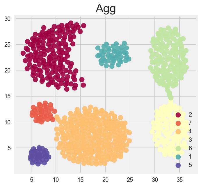
Agg
Which algorithm (visually) performs best?
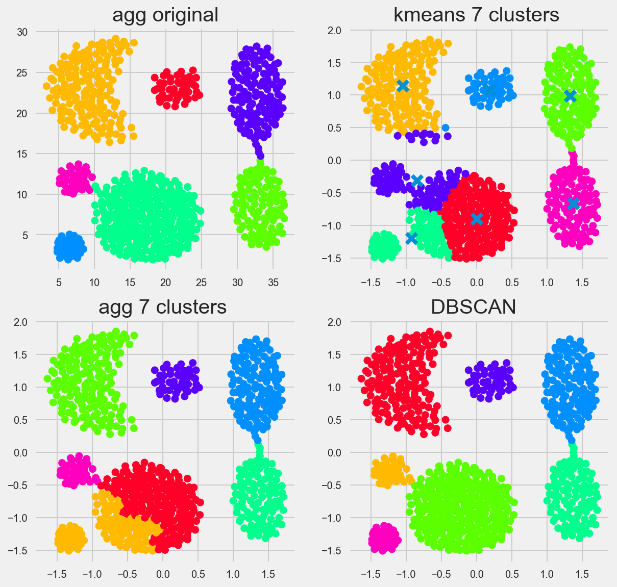
You can reallllyy tune DBSCAN, here I had epsilon (our distance between samples in a cluster) to be 0.218 and had the min number of samples as 13.
Out of the box though, kmeans, and heirarchical clustering didn’t do a bad job. you can see by how they grouped their clusters that both of these use distance metrics primarily. K means uses distances from a center point ‘X’, while Agglomerative/Heirarchal sees which points are closest togethor, creates a group and then adds members by calculating the shortest distance from any member of the new group to another point not in the group. We set the groups to 7, so the algorithim stops when it has seven groups.
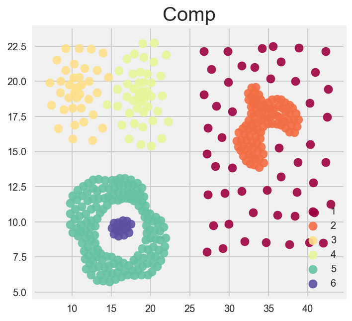
Comp
Which algorithm (visually) performs best?
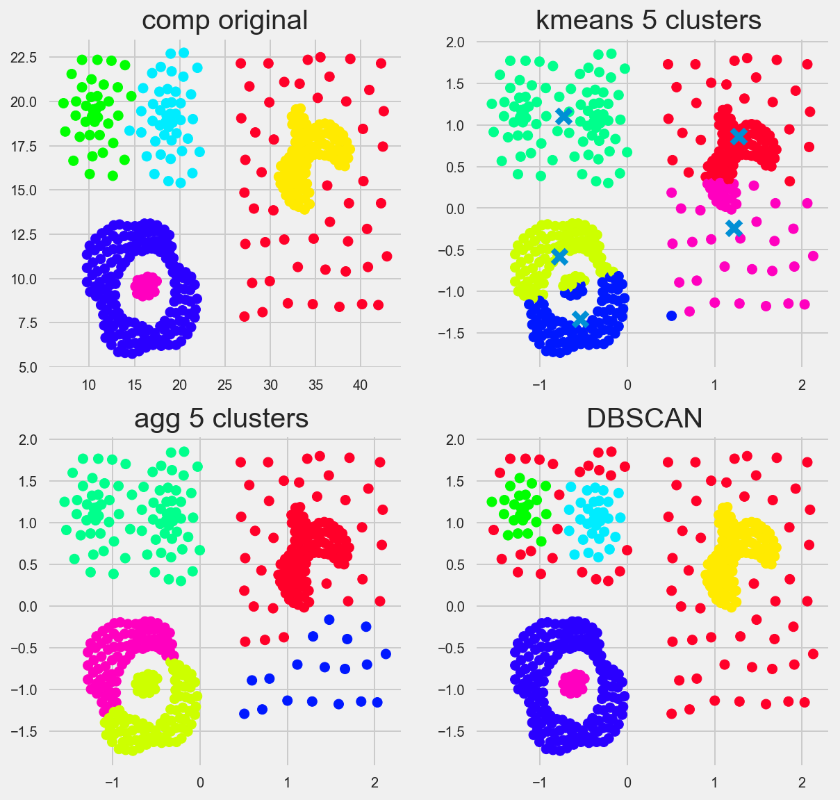
DBSCAN performs best, but really, none of them are perfect. This demonstrates something that we should be aware of when using unsupervised clustering algorithims. is that clusters or groups with different distances, or densities will be seen as different groups. In this case, the red dots in the DBSCAN image are considered outliers or not belonging to a group.
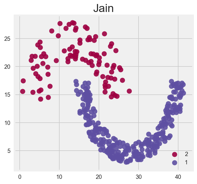
Jain
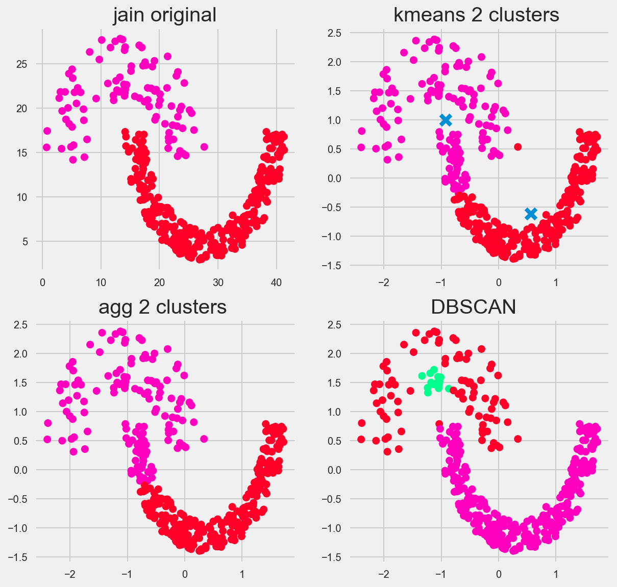
I found this one really fascinating. I could have probably fine tuned DBSCAN even more, but regardless it found 3 groups instead fo two. again highlighting the issue with clusters that have different intradistances between points. AKA if cluster A has a distance of 1, and cluster B has a distance 2, this is problematic for our algorithm.
I like how Kmeans and Agglomerative/Heirarchal attempt this. You can clearly see kmeans takes a mean centered approach and heirarchal takes a bottom up approach.
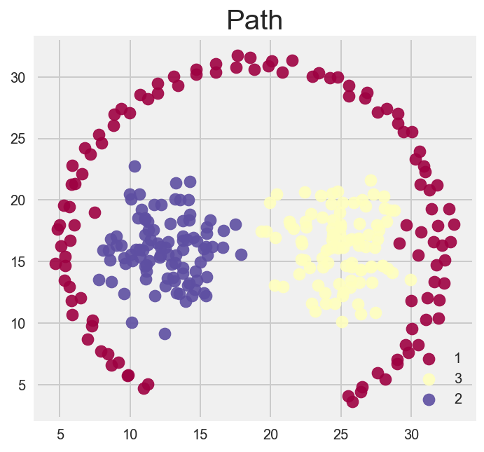
Pathbased
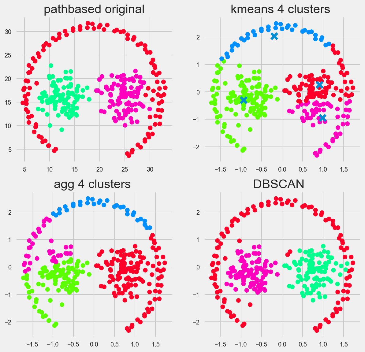
DBSCAN for the win, theres a general theme isn’t there?
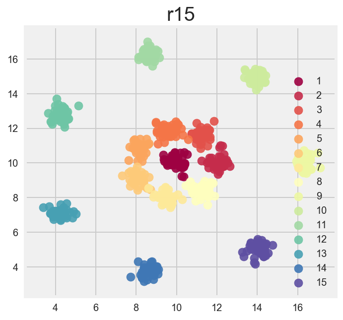
r15
my favorite data set of them all. Reminds of playing paintball.
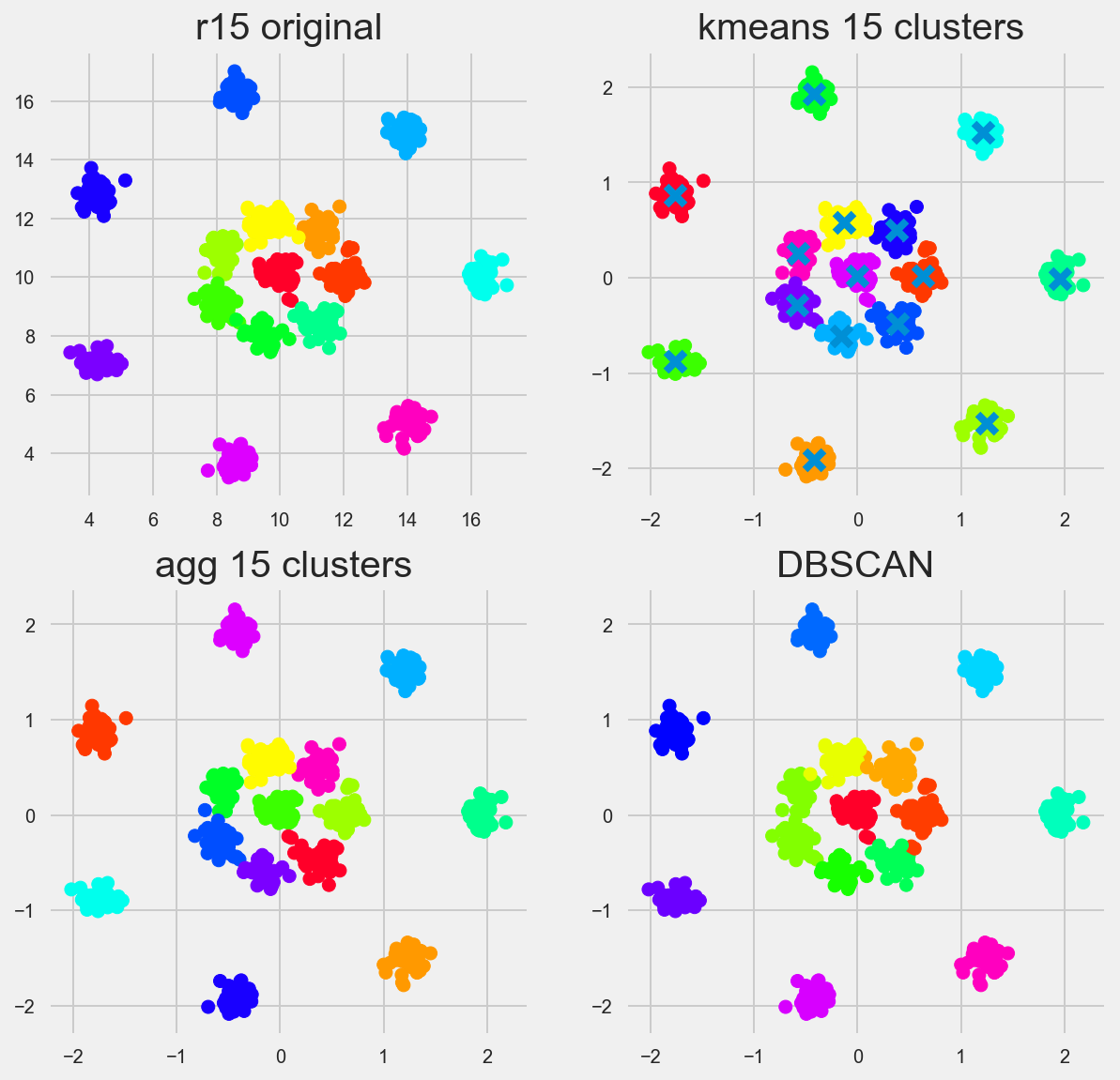
Kmeans and Agglomerative/Heirarchal perform perfectly right out of box. DBSCAN does well here too. I’d say this is a threeway tie.
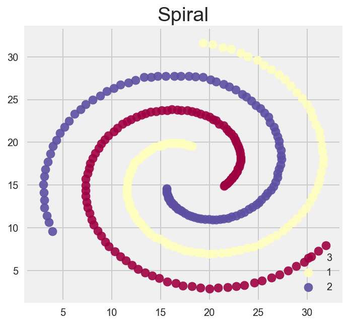
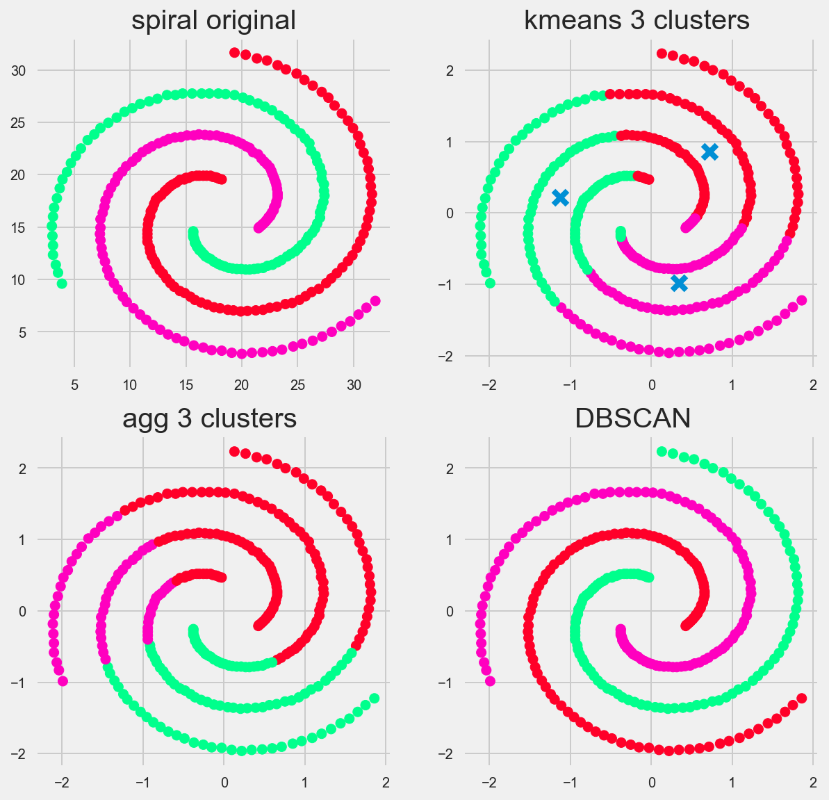
Spiral
The spiral is where we can really see DBSCAN shine and gain some intuition on how the algorithm works
Future considerations
I’d love to see how Affinity Propogation holds up on these data sets. Maybe in the future I’ll do a 4 way battle ala Mario Kart style!
Iowa Liquor Sales
What do they drink?
Forecasting Liquor Sales in the State of Iowa

Exploring the data
I performed some exploratory statistical analysis and made some plots, such as histograms of transaction totals, bottles sold, etc.
I had to clean and munge the data first. Checking for Missing values and NaNs. I try and stay away from code snippets in my blog posts, but i just wanted to show one here to give the viewer a better sense of the columns of table and the datatype they were encoded in.
import seaborn as sns
import matplotlib.pyplot as plt
%matplotlib inline
df.info()
#looks likesome Nulls in County and county number. lets use either city and or zipcode and see how much each
#city/zipcode sold
#change all prices into floats.
<class 'pandas.core.frame.DataFrame'>
Int64Index: 2709552 entries, 695077 to 2709551
Data columns (total 24 columns):
Invoice/Item Number      object
Date                     datetime64[ns]
Store Number             int64
Store Name               object
Address                  object
City                     object
Zip Code                 object
Store Location           object
County Number            float64
County                   object
Category                 float64
Category Name            object
Vendor Number            int64
Vendor Name              object
Item Number              int64
Item Description         object
Pack                     int64
Bottle Volume (ml)       int64
State Bottle Cost        object
State Bottle Retail      object
Bottles Sold             int64
Sale (Dollars)           object
Volume Sold (Liters)     float64
Volume Sold (Gallons)    float64
dtypes: datetime64[ns](1), float64(4), int64(6), object(13)
memory usage: 516.8+ MB
Sales, Cost, and Retail are stored as a non numeric object, so lets get rid of the dollar sign and store it as a float
df['Sale (Dollars)'] = df['Sale (Dollars)'].str.replace('$', '').astype('float64')
df['State Bottle Cost'] = df['State Bottle Cost'].str.replace('$', '').astype('float64')
df['State Bottle Retail'] = df['State Bottle Retail'].str.replace('$', '').astype('float64')
When working with Strings I tend to either keep them lowercase or uppercase so just in case people have entered the cities with the first letter capitalized or not the computer won’t equte them as different values aka cities.
df['City'] = df['City'].map(lambda x: x.upper())
I saw some of the cities were mispelled, in the long run this probably wont make a difference but i renamed them anways.
#
df['City'] = df['City'].map(lambda x: x.replace('MT','MOUNT') if x[0] == 'M' else x)
df['City'] = df['City'].map(lambda x: x.replace('ST ','ST. ') if x[0] == 'S' else x)
df['City'] = df['City'].map(lambda x: x.replace('OTTUWMA','OTTUMWA') if x == 'OTTUWMA' else x)
df['City'] = df['City'].map(lambda x: x.replace('LEMARS','LE MARS') if x == 'LEMARS' else x)
df['City'] = df['City'].map(lambda x: x.replace('LECLAIRE','LE CLAIRE') if x == 'LECLAIRE' else x)
df['City'] = df['City'].map(lambda x: x.replace('GUTTENBURG','GUTTENBERG') if x == 'GUTTENBURG' else x)
Lets show the cities with the top 25 sales.
In keeping with xkcd comic above, lets use xkcd style in our graphs!
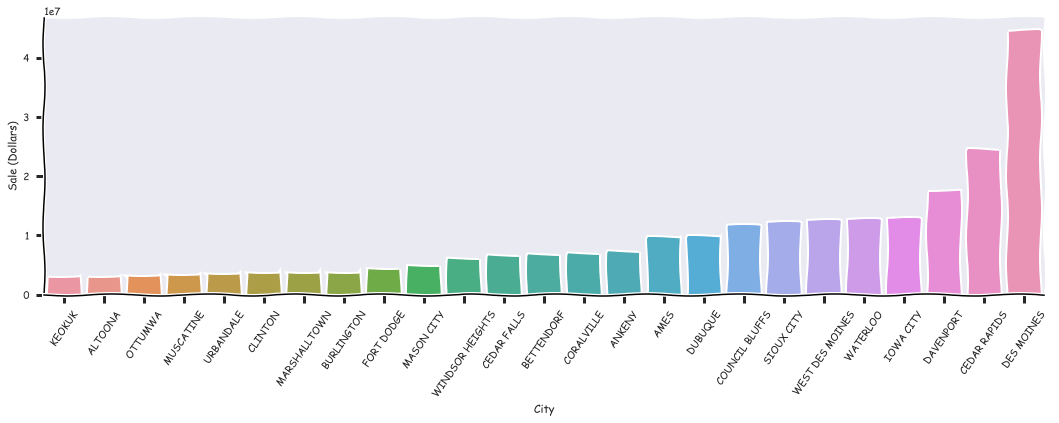
Here are a few stores with the best sales for the year of 2015
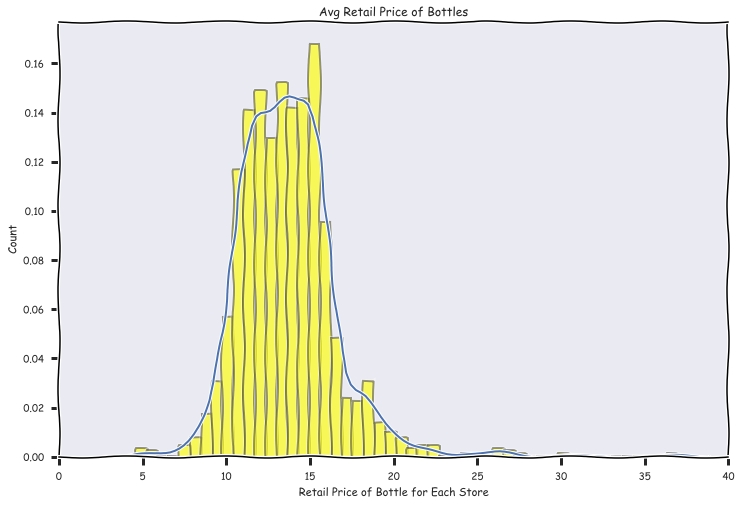
Avg Retail Price per Bottle
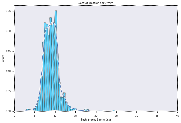
Cost of Bottle per store
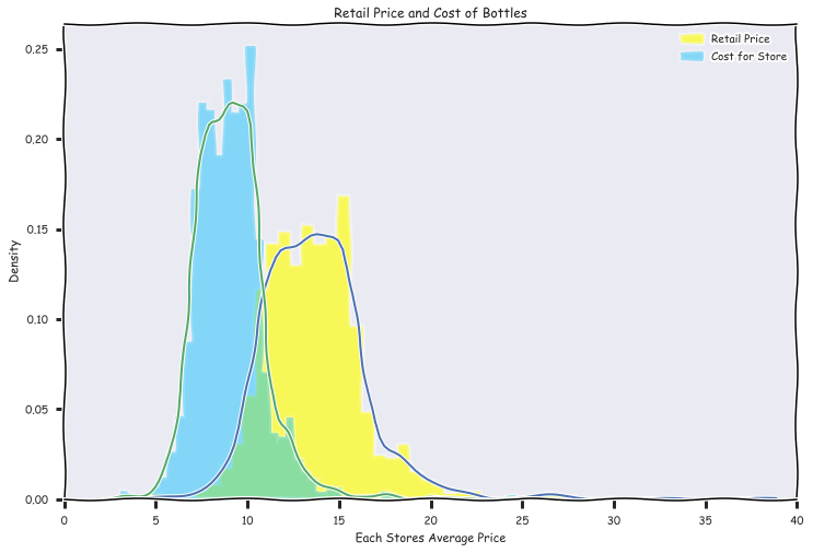
Cost and Retail plotted on the same graph, I included some code to see how seaborn uses matplotlib functionality
fig, ax = plt.subplots(figsize = (12,8))
#c1, c2, c3 = sns.color_palette("Set1", 3)
ax.set_xlim(xmin = 0, xmax = 40)
plt.xkcd()
sns.distplot(df.groupby('Store Number')['State Bottle Retail'].mean(),
             hist_kws={"histtype": "stepfilled", "color": "yellow"},
             norm_hist = False,
             kde = True,
             ax = ax,
             label = 'Retail Price')

sns.distplot(df.groupby('Store Number')['State Bottle Cost'].mean(),
             hist_kws={"histtype": "stepfilled", "color": "deepskyblue", 'alpha': .25},
             norm_hist = False,
             kde = True,
             ax = ax,
             label = 'Cost for Store')

plt.title('Retail Price and Cost of Bottles')
plt.ylabel('Density')
plt.xlabel('Each Stores Average Price')
plt.legend()
<matplotlib.legend.Legend at 0x2b2d40024e0>
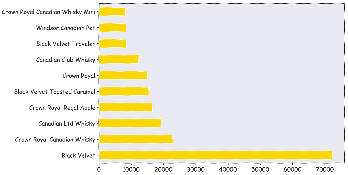
fig, ax = plt.subplots(figsize = (18,12))
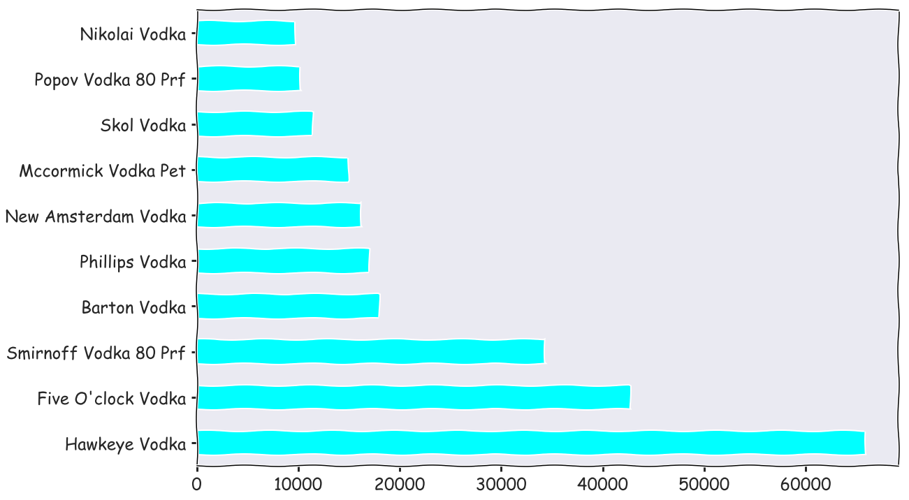
df[df['Category Name'] == 'CANADIAN WHISKIES']['Item Description'].value_counts().head(10).plot(kind = 'barh', color = 'gold', fontsize = 24)
<matplotlib.axes._subplots.AxesSubplot at 0x2b2d4133c88>
fig, ax = plt.subplots(figsize = (18,12))
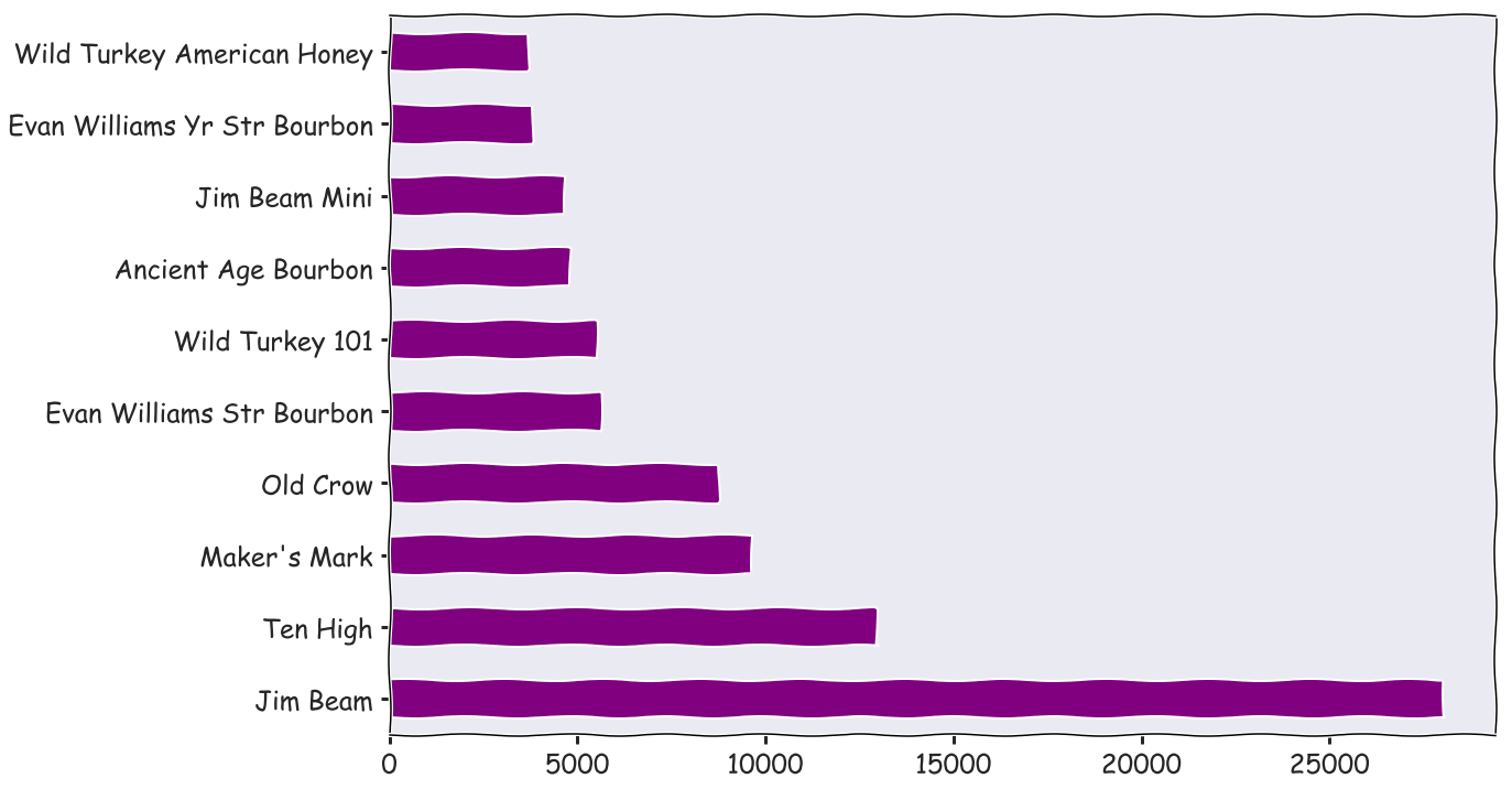
df[df['Category Name'] == 'STRAIGHT BOURBON WHISKIES']['Item Description'].value_counts().head(10).plot(kind = 'barh', color = 'purple', fontsize = 24)
<matplotlib.axes._subplots.AxesSubplot at 0x2b2a37898d0>
EDA Findings summarized
top 5 stores with highest total sales are: DES MOINES |2633 |12282646.26 DES MOINES |4829 |11085530.53
| IOWA CITY | 2512 | 5206377.22 |
| CEDAR RAPIDS | 3385 | 4759187.79 |
| WINDSOR HEIGHTS | 3420 | 4018414.55 |
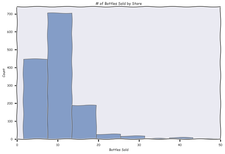
The average number of bottles sold by store per transaction was 10 bottles, there was a heavy positive skew though
average retail cost was 14.7 - averate store cost 9.8 = 4.9$ margins on each bottle sold
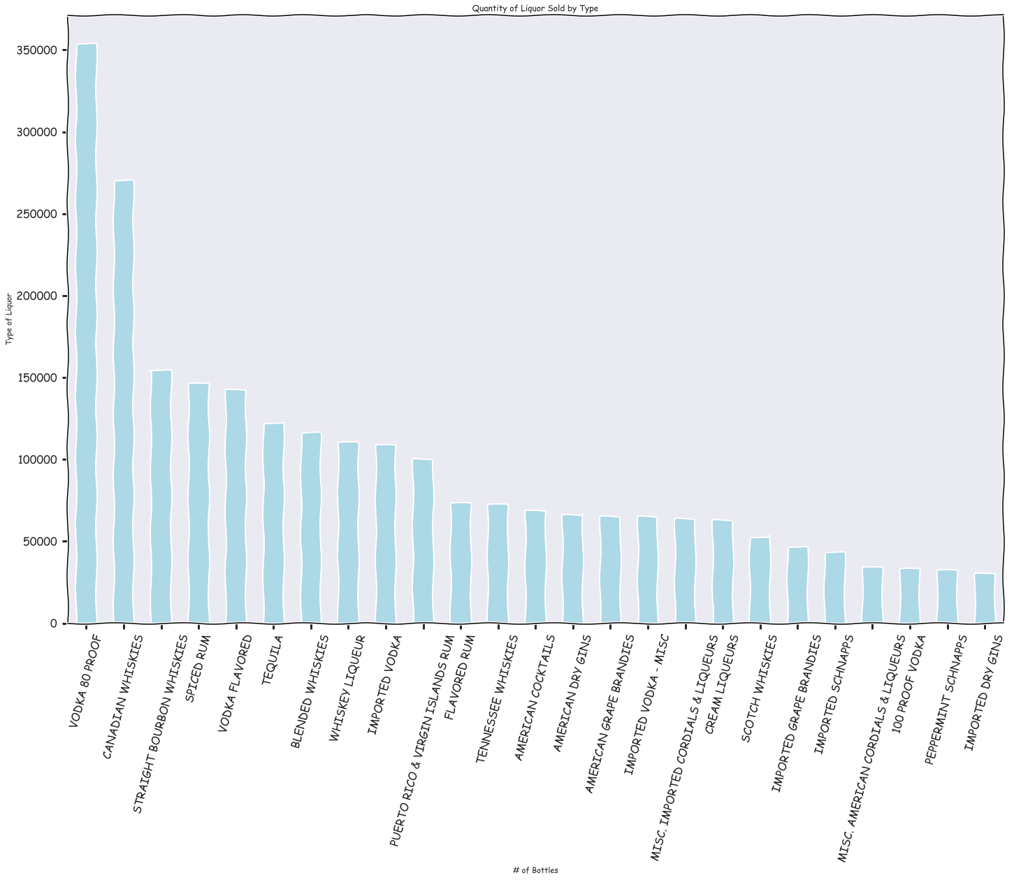
Vodka 80 proof, Canadian whiskeys, and straight bourbon whiskies were the most popular type of liquors
Haweye vodka, black velvet, and Jim bean were the top sellers in those respective categories
Mining and Refining the data
Now I’m ready to compute the variables I’ll use for my regression from the data. For example, I computed the total sales per store from Jan to March of 2015, mean price per bottle, etc.
I created added my predictors piecemeal to a pandas dataframe
I also started looking for relationships within the data and amongst the variables to get a better sense of what I wanted to include in my final model
| Store Number | Jan to March Sales | Avg Bottles Sold | Avg Bottle Retail | Avg Bottle Cost | Avg Volume Sold (Liters) | |
|---|---|---|---|---|---|---|
| 0 | 2106 | 337166.53 | 19.514209 | 16.126917 | 10.744967 | 18.355608 |
| 1 | 2113 | 22351.86 | 4.667047 | 15.963609 | 10.632919 | 4.623090 |
| 2 | 2130 | 277764.46 | 18.523256 | 15.386269 | 10.251927 | 16.787416 |
| 3 | 2152 | 16805.11 | 4.024110 | 13.139489 | 8.742015 | 4.195431 |
| 4 | 2178 | 54411.42 | 7.677192 | 15.127811 | 10.068841 | 8.070549 |
| 5 | 2190 | 255939.81 | 8.285090 | 18.142489 | 12.086029 | 5.056179 |
| 6 | 2191 | 319020.69 | 13.863643 | 17.125039 | 11.411090 | 14.230320 |
| 7 | 2200 | 45340.33 | 4.001452 | 17.425620 | 11.606667 | 4.477271 |
| 8 | 2205 | 57849.23 | 6.048682 | 15.036204 | 10.013212 | 5.043834 |
| 9 | 2228 | 51031.04 | 5.333907 | 15.000341 | 9.989567 | 5.354428 |
Refine the data
fig, ax = plt.subplots(figsize = (18,12))
sns.set(font_scale=3)
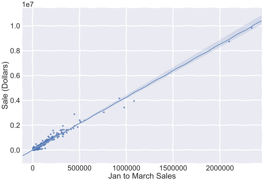
sns.regplot(x = 'Jan to March Sales', y = 'Sale (Dollars)', data = X.merge(target, how = 'left', on = ('Store Number')))
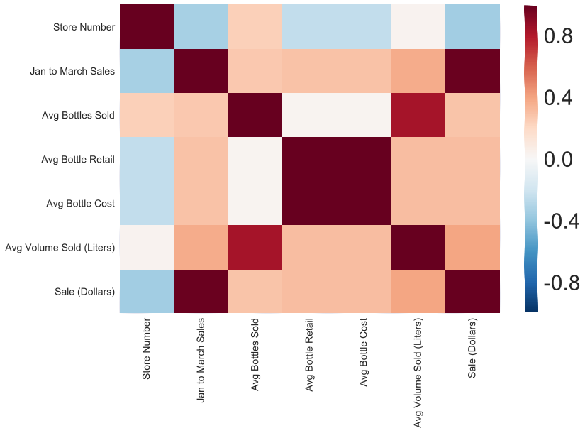
Here’s a Heat Map demonstrating correlation of my predictors
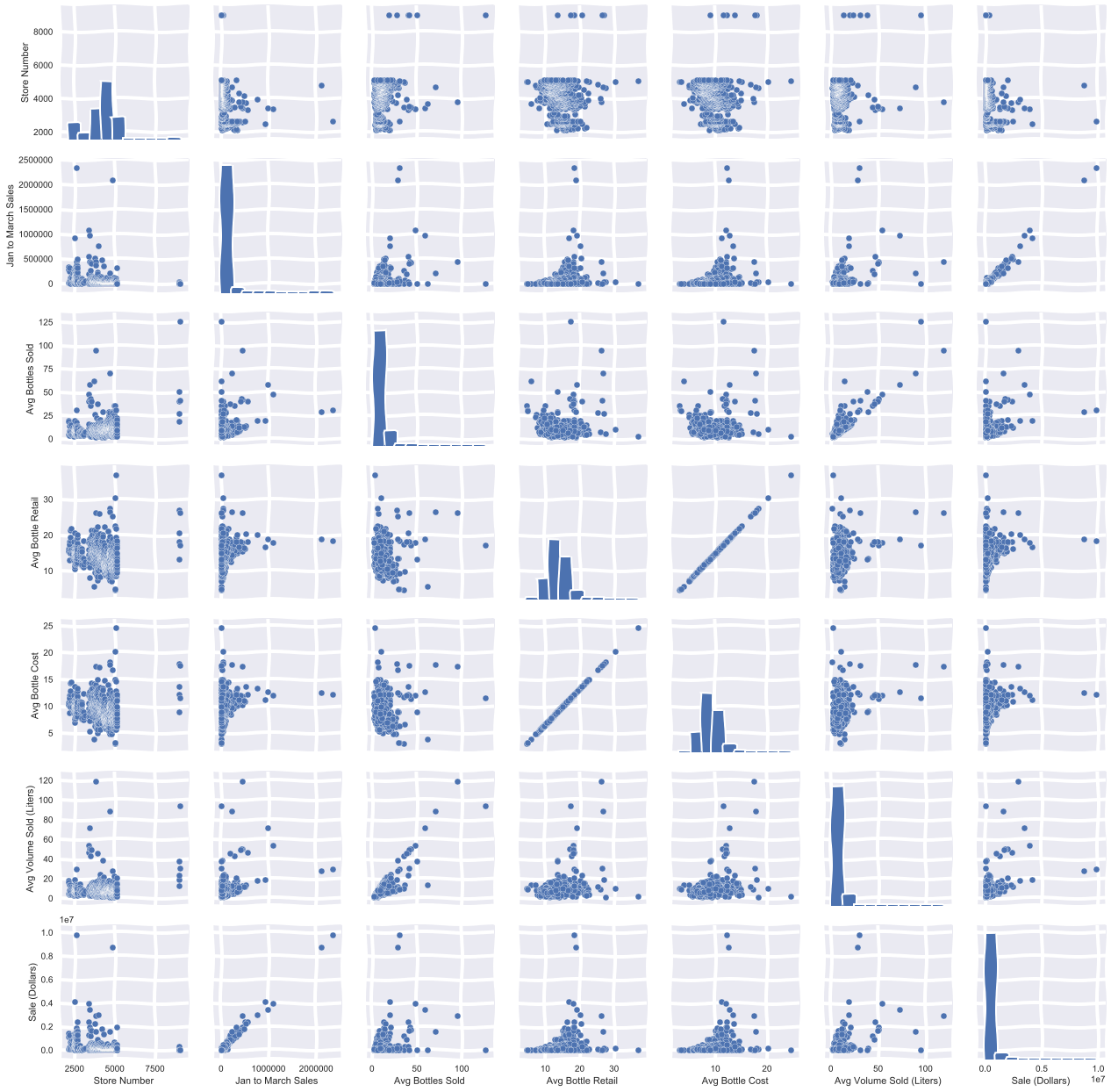
#this takes a while to run, it just visualizes the above correlation matrix
sns.set()
sns.pairplot(X.merge(target, how = 'left', on = ('Store Number')))
Building the model
I used sklearn to build a regression model and evaluated it’s performance
I standardized my values first before I threw them into my model, This is almost always a good idea and necessary when using regularization. It prevents variables with larger numerical scales from overshadowing variables with smaller numerical scales.
I also cross validated to find the best hyperparameters, in this case ‘C’ for our error terms in the regularized regression model. I’m not going to put the code here, you can see it all on my github
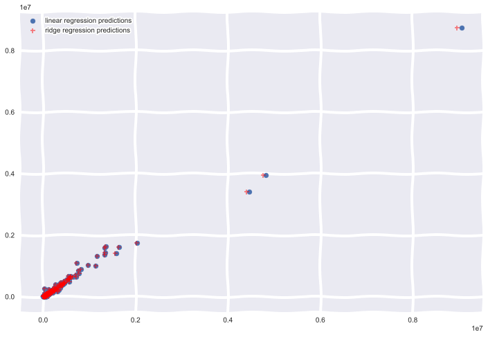
Results
I plotted the predictions of my models below
Summary
On average the difference in yearly sales for iowa liquor stores from 2016 to 2015 was 9,215, thats a $9,215 per store on average increase in yearly sales in 2016, very little difference bewteen my Ridge Regression and linear regression models, most likely because jan - March sales were so heavily correlated with total Sales.